Brand Guide | Freelancing







Rebrand | Medical Clinic
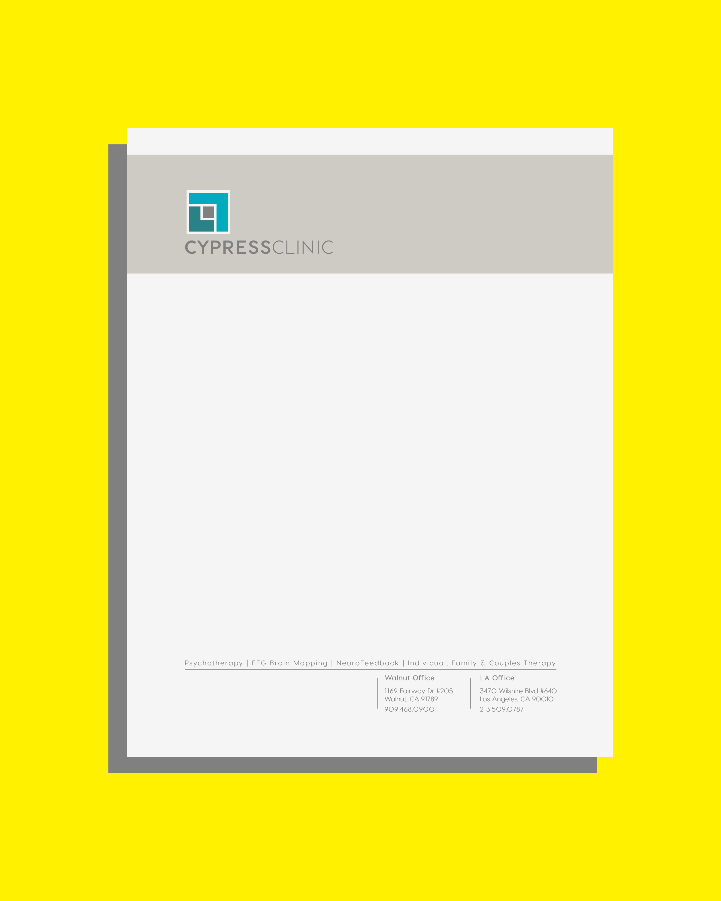
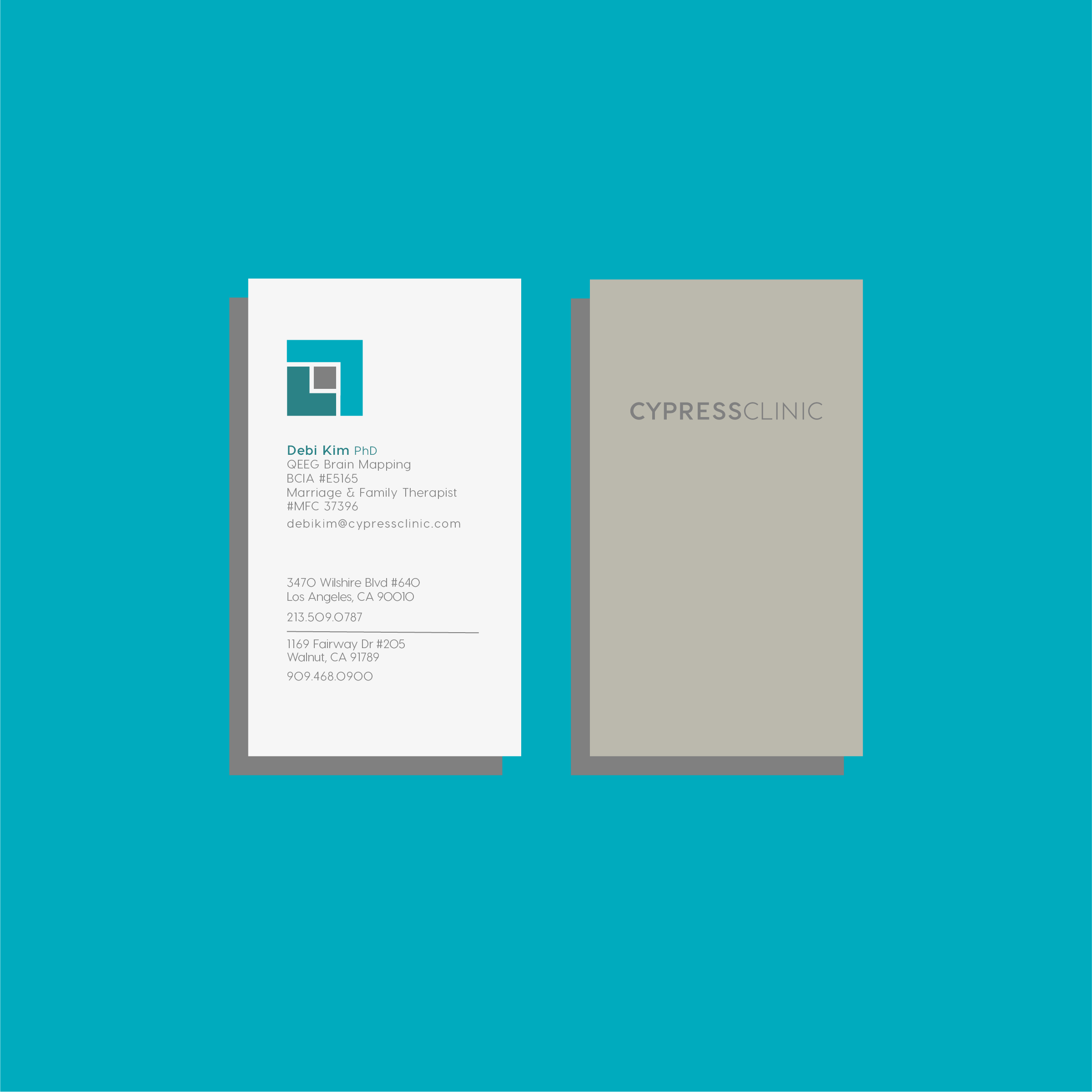
2 green elements are 2 overlapping C’s which represent the name Cypress Clinic
Birdseye view of someone being hugged [gray = heads ; greens = 2 bodies/arms hugging], the clinic helps people overcome battles with mental health issues
2 green elements are arrows pointing in opposite directions; yin & yang; 1 arrow is dark and points down, equating negativity; the other arrow is light and points up equating positivity (the clients work helping individuals overcome depression)
Square shape represents stability and a solid foundation, which is derived from the meaning of a cypress tree (name of the clinic)
Green colors (edited from original) are derived from the cypress tree
Gray color in the middle represents where the patients mental state is when they first come to the clinic

Brand Development
*important note: all content is original; from each name, logo, slogan, too premise, all have been developed from scratch. Some as concepts; others for production. The majority were created for start-ups. For each, I was tasked with developing the entire creative-direction from start to finish. While I take the utmost pride in my work and always strive to create something that is aesthetically pleasing, my primary objective is to create works of substance. [creative substance = my greatest strength] & I attempt to showcase that here.
